Layout and presets
Pick a template, then place the phone, the text and the card, and save a layout to reuse it.
The inspector's Layout tab holds the screen's template and every position and size on it. Each control starts at Auto, the template's own default, and a value you set (by typing, with the slider, or by dragging on the canvas) can always go back to it.
Templates
| Template | What it is | Devices |
|---|---|---|
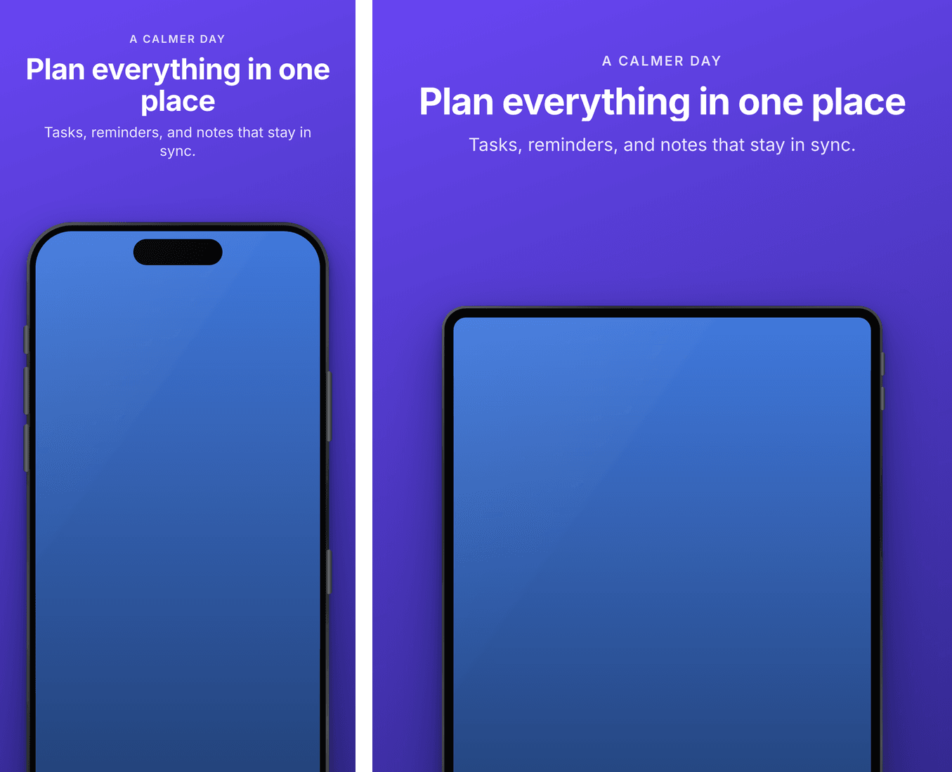
| Hero Top | Eyebrow, headline and caption above the phone | iPhone, iPad, Play, event images; portrait and landscape |
| Split Caption | The text beside the phone | iPhone, iPad, Play, event images; portrait |
| Full Bleed Card | The capture fills the screen, the copy on a card | iPhone, iPad, Play; portrait and landscape |
| Feature Graphic | A wide layout for header, search, Play feature and event images | Header, search, universal, Play feature graphic, event card |
The picker lists only the templates that work on the device shown. Templates are React
components in the engine's templates/ folder; you can write your own.
Phone
- Size, Across, Down and Tilt place the phone. Center puts it back in the middle; Reset Phone puts everything back.
- Frame is the body around the capture:
- Dark (the default) and Light: the drawn body, with a titanium band, glass border, Dynamic Island and the buttons in the right place, in portrait and landscape. iPads get their own band and buttons. The body is drawn around the display, so the capture keeps its full size.
- None: the capture alone, with the device's rounded corners.
- Device Frames: Apple's official frames, from
fastlane frameit. Runstore-shots frames setuponce to download them;store-shots frames listshows them.
An app with both iPhone and iPad sets keeps a frame per family, so each wears its own.
Text
Width of the text column, Side (leading or trailing), Alignment, Across and Down, Colour and Accent. Changing the width changes the room each field has; the counts in the Text tab follow. Reset Text Position puts the text back where the template puts it. On a wide screen, each slide's text has its own position.
Card
Full Bleed Card adds the card's Position (top or bottom) and Colour.
Presets
A preset is a screen's whole layout under a name. Save Layout as Preset... stores this
screen's, and Apply Preset gives another screen the same one: the quickest way to make a
set of screens agree. Presets live in store-shots.config.json, under presets.
In the files
Everything on this tab is the screen's overrides in store/manifest.json:
"overrides": {
  "screenshotScale": 0.86,
  "screenshotOffsetY": 0.12,
  "deviceTilt": -6,
  "textAlign": "start",
  "shell": "light"
}